UX Design · Interaction Logic · Prototyping
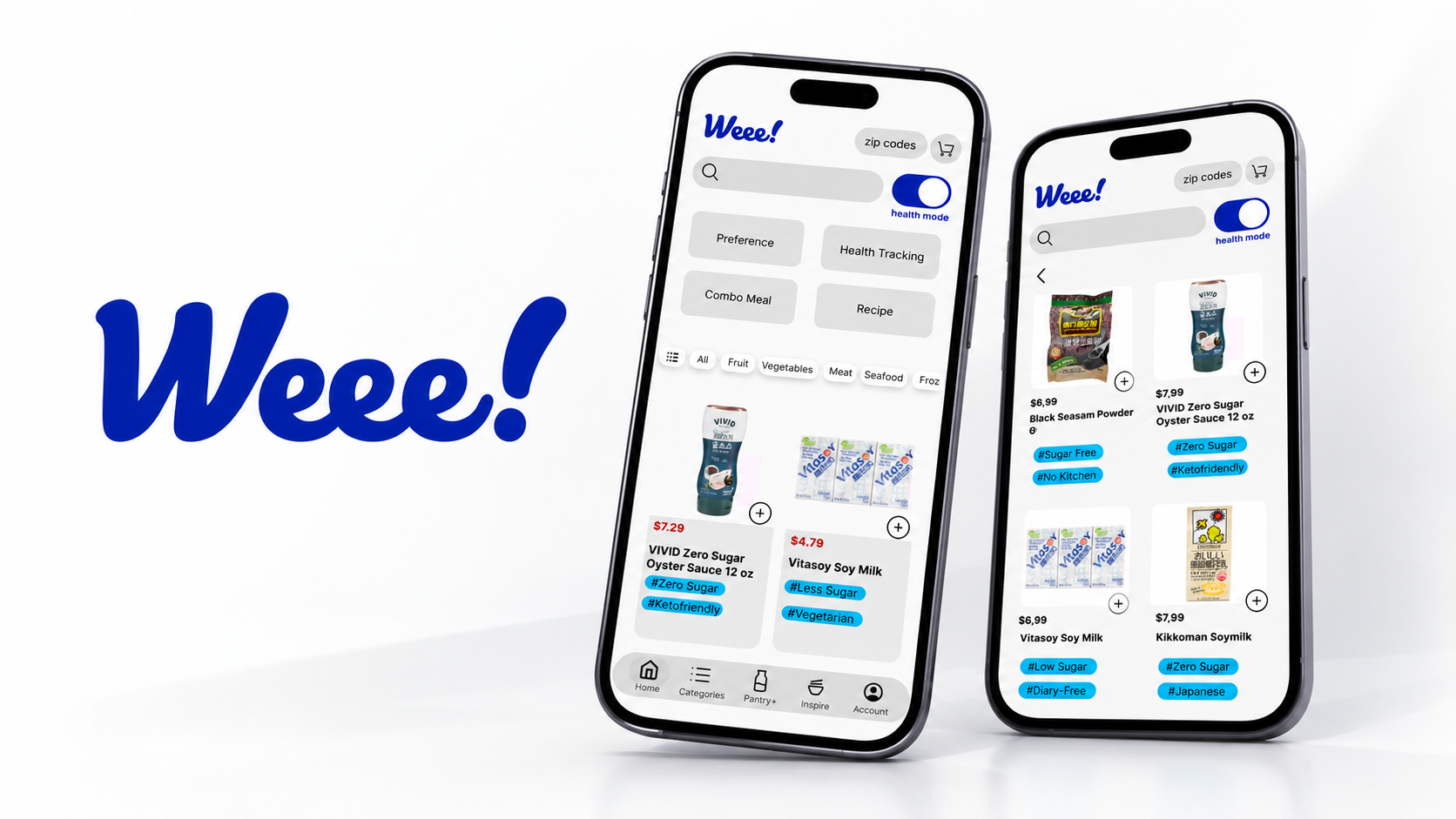
Weee!
(brief)
Rethinking how healthy decisions fit into everyday grocery shopping.
Case study
The Challenge
Weee! makes it easy to access Asian groceries. But for users trying to eat healthier, more choices do not necessarily make decisions easier.
Nutrition information existed, recipes existed, and shopping tools existed—but they did not work together to answer a simple question:
What should I choose for myself?
The core question became:
How might we support healthier decisions without adding more complexity to grocery shopping?
Start With the Decision, Not the Feature
Our research suggested that users struggled at different moments for different reasons.
Some did not know where to start. Some knew their health goals but could not quickly evaluate products. Others thought about what they wanted to eat, rather than which individual ingredients to buy.
That changed our approach.
Instead of asking:
What health features should we add?
we asked:
Where does the user actually need help making a decision?
This became the logic behind the experience.
Building a Decision Flow
I translated that logic into the prototype by connecting four moments:
Set preferences Help me choose
Surface relevant guidance Help me act
Turn meals into purchases Help me reflect
Track what was actually eaten
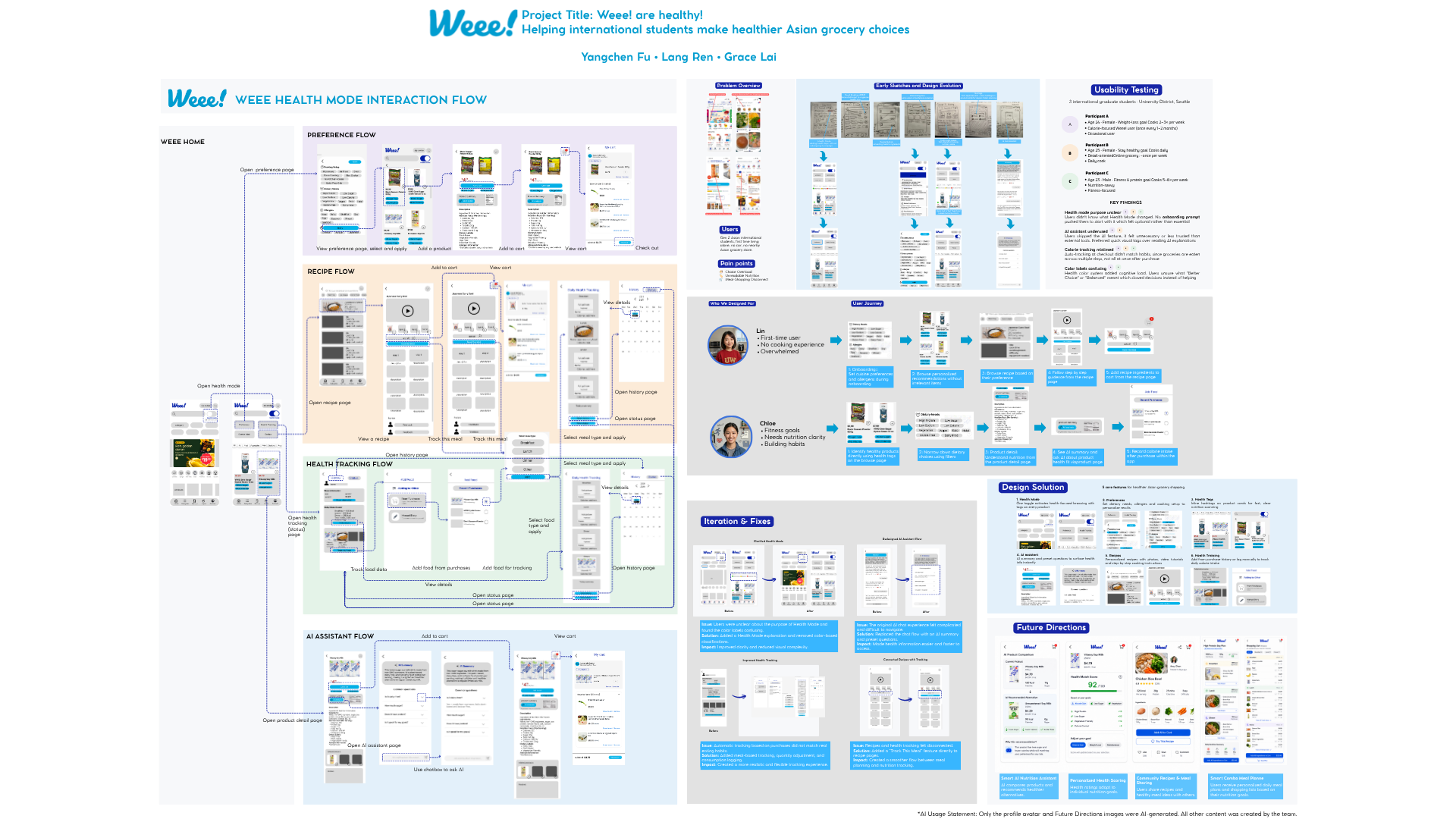
Connecting the Experience
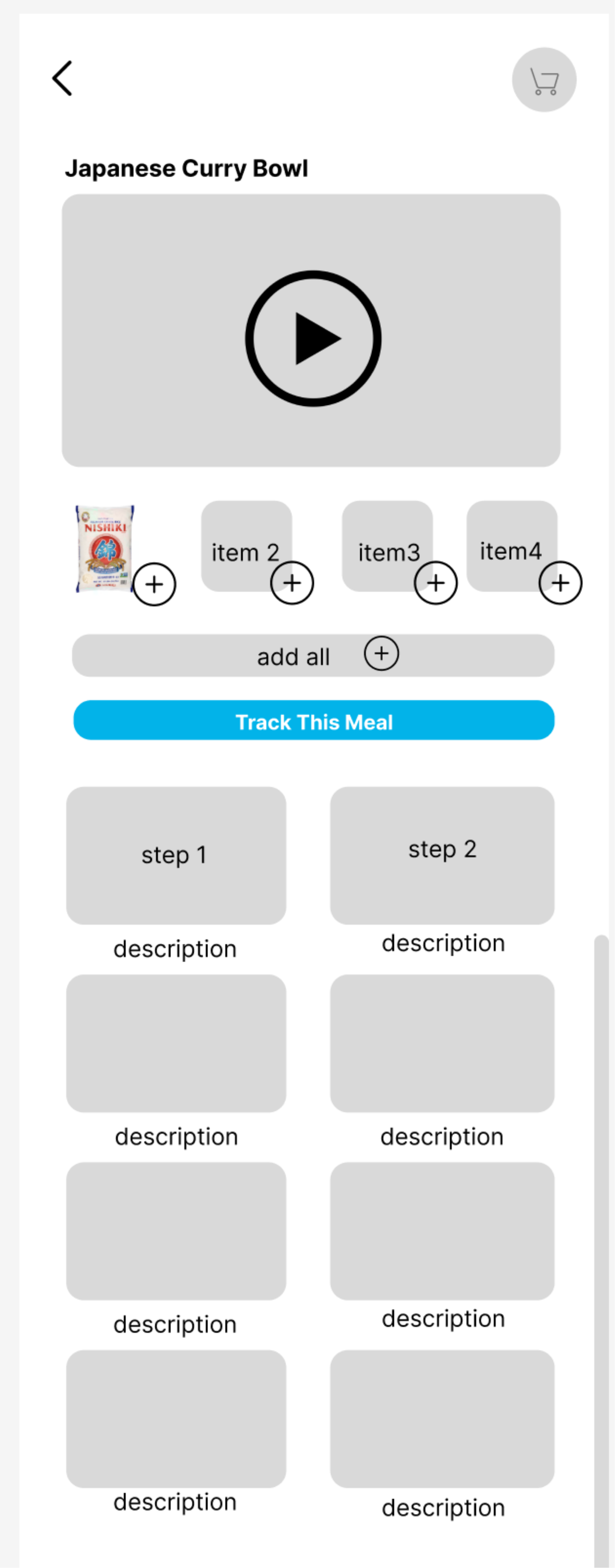
One key idea was to design around meals rather than individual products.
Instead of:
Browse -> Buy -> End
we explored:
Discover a meal -> Buy ingredients -> Cook -> Track what was eaten
This made Recipe more than content—it became a bridge between shopping and health tracking.
Testing Our Assumptions
The first prototype helped us see something important:
A flow can be complete and still be logically wrong.
Usability testing exposed several assumptions we had made about how users would understand and use the system.
That became the focus of the next iteration.
Iteration & Fixes
The iteration work was not about making the screens more polished. It was about asking whether the product logic matched real user behavior.
01 — Health Mode
Make the mode predictable
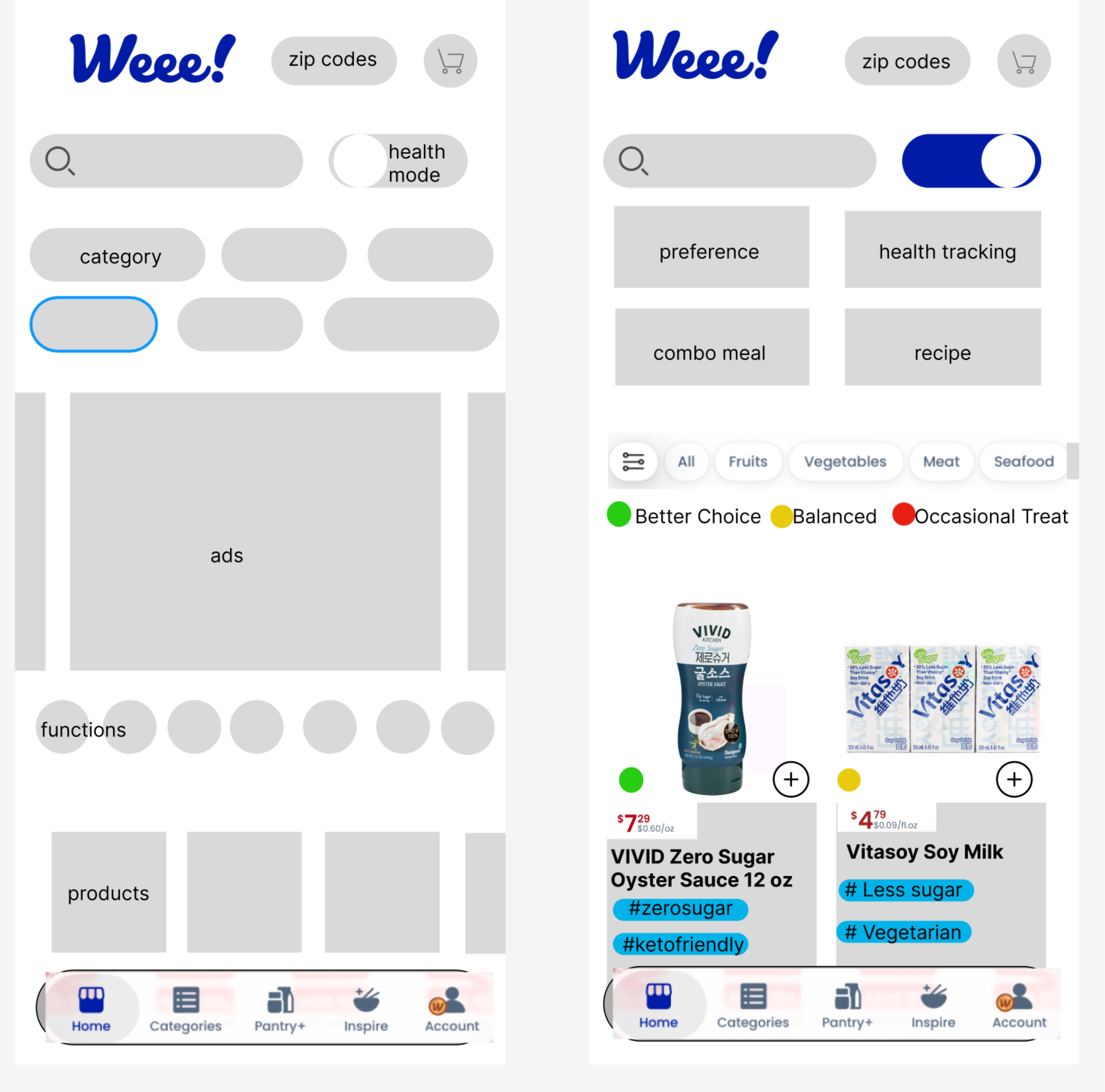
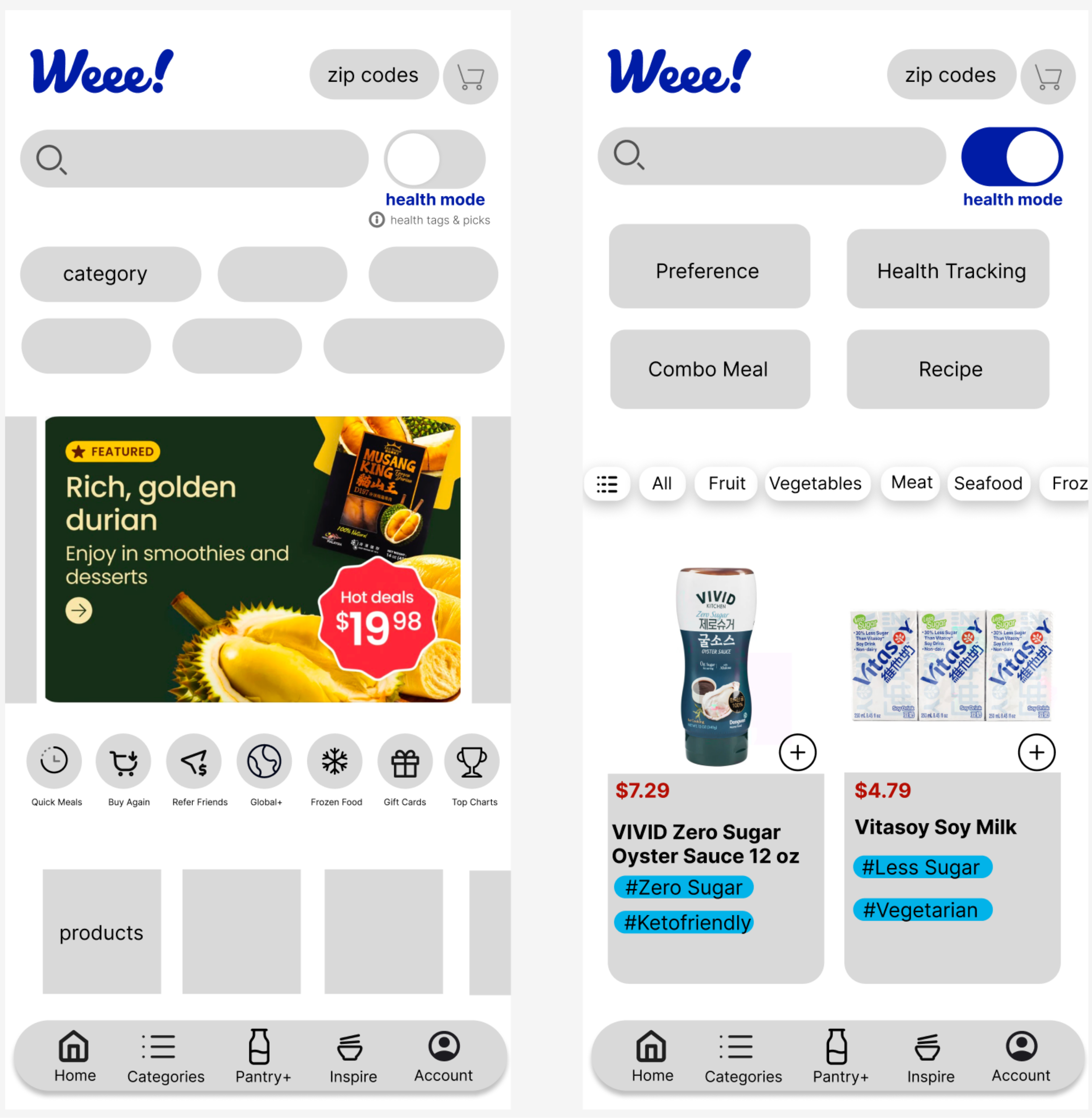
We assumed that turning on Health Mode would make its purpose obvious. It didn't.
Users could see the control, but could not clearly understand what would change or how it would help them.
UX Decision: Instead of adding more visual signals, we made the effect of Health Mode more explicit and reduced reliance on color-coded grading.
A mode only works when users can predict what activating it will change.
Clearer mode behavior
02 — AI Assistant
Reduce the first decision
The AI Assistant was meant to reduce uncertainty.
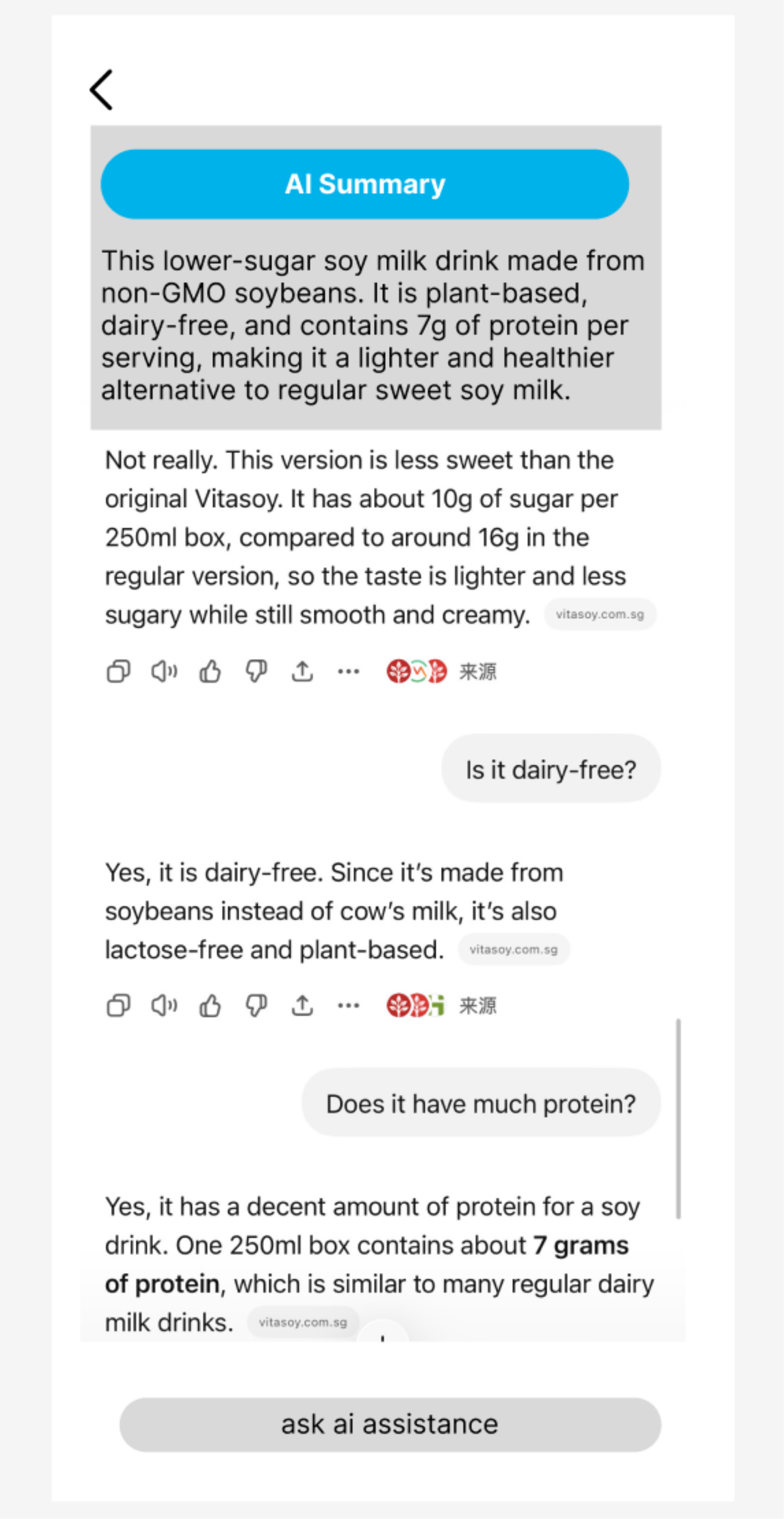
But an empty chatbot immediately asked the user to make another decision: “What should I ask?” That contradicted the reason the assistant existed.
UX Decision: We introduced guided questions and clearer entry points.
A tool designed to reduce uncertainty shouldn't begin by creating more of it.
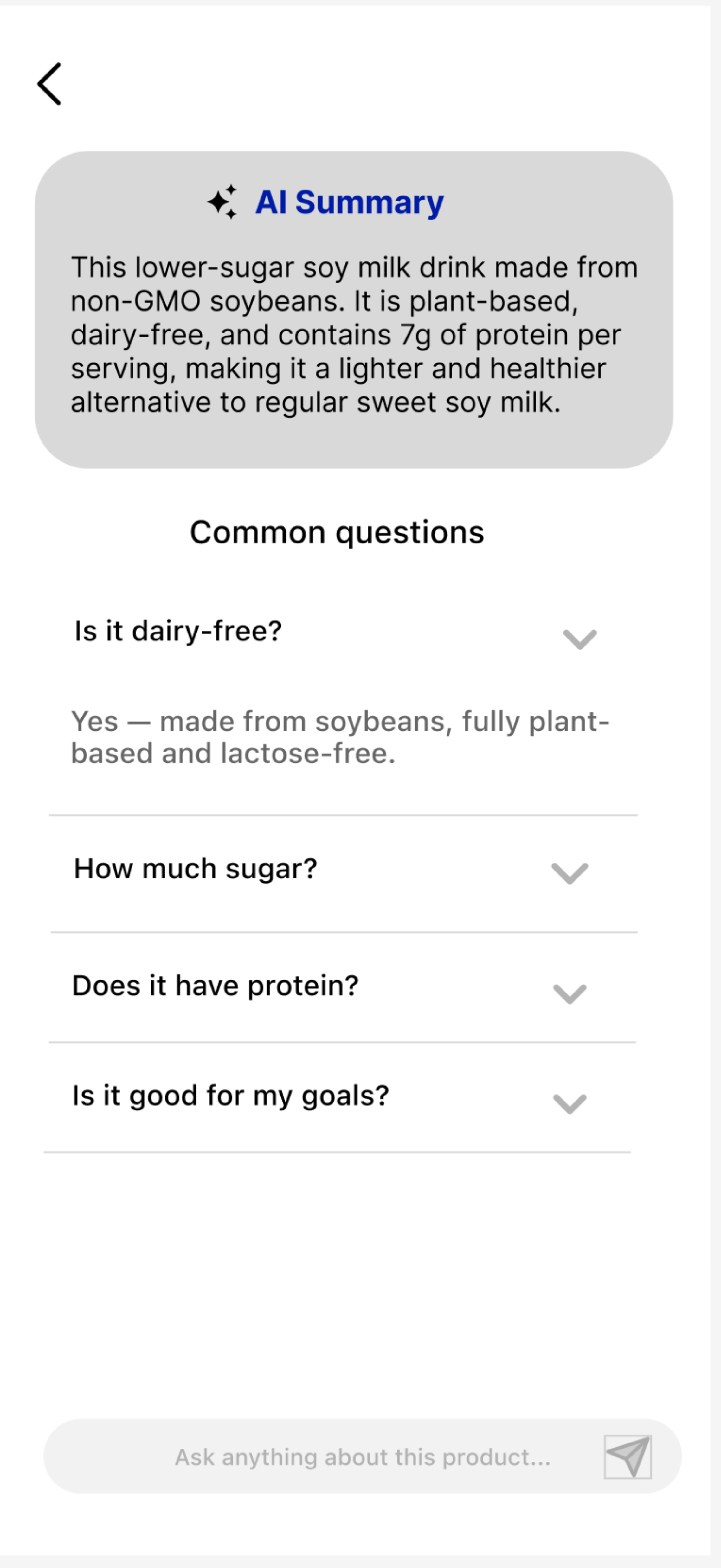
Guided starting points
03 — Health Tracking
Separate shopping from eating
Our early tracking logic used grocery purchases as a shortcut for consumption.
But the assumption was flawed: “Purchased ≠ Eaten.” A week's groceries might be purchased at once, eaten across several days, shared with someone else, or never eaten at all.
UX Decision: We separated shopping behavior from eating behavior and moved tracking closer to actual meals.
The easiest data to collect is not always the right behavior to design around.
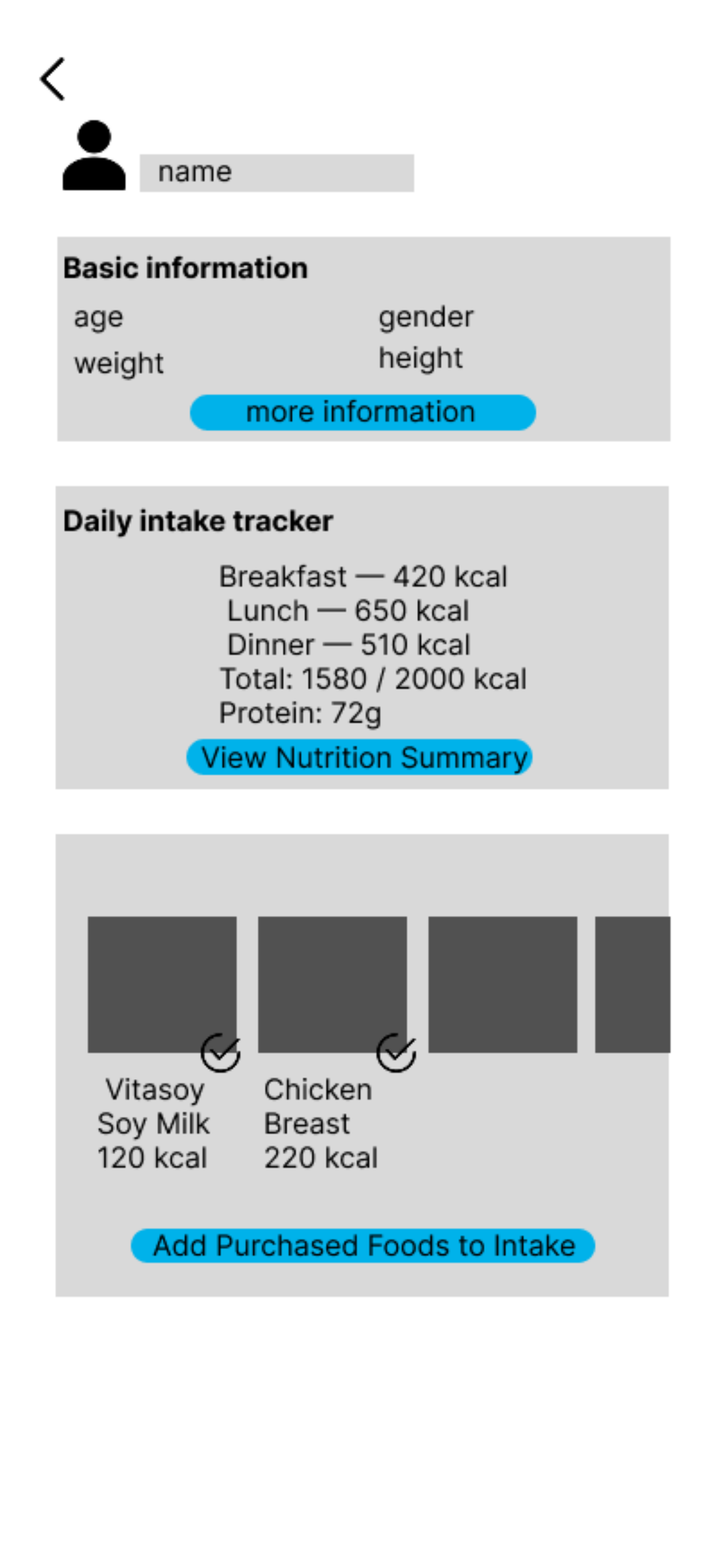
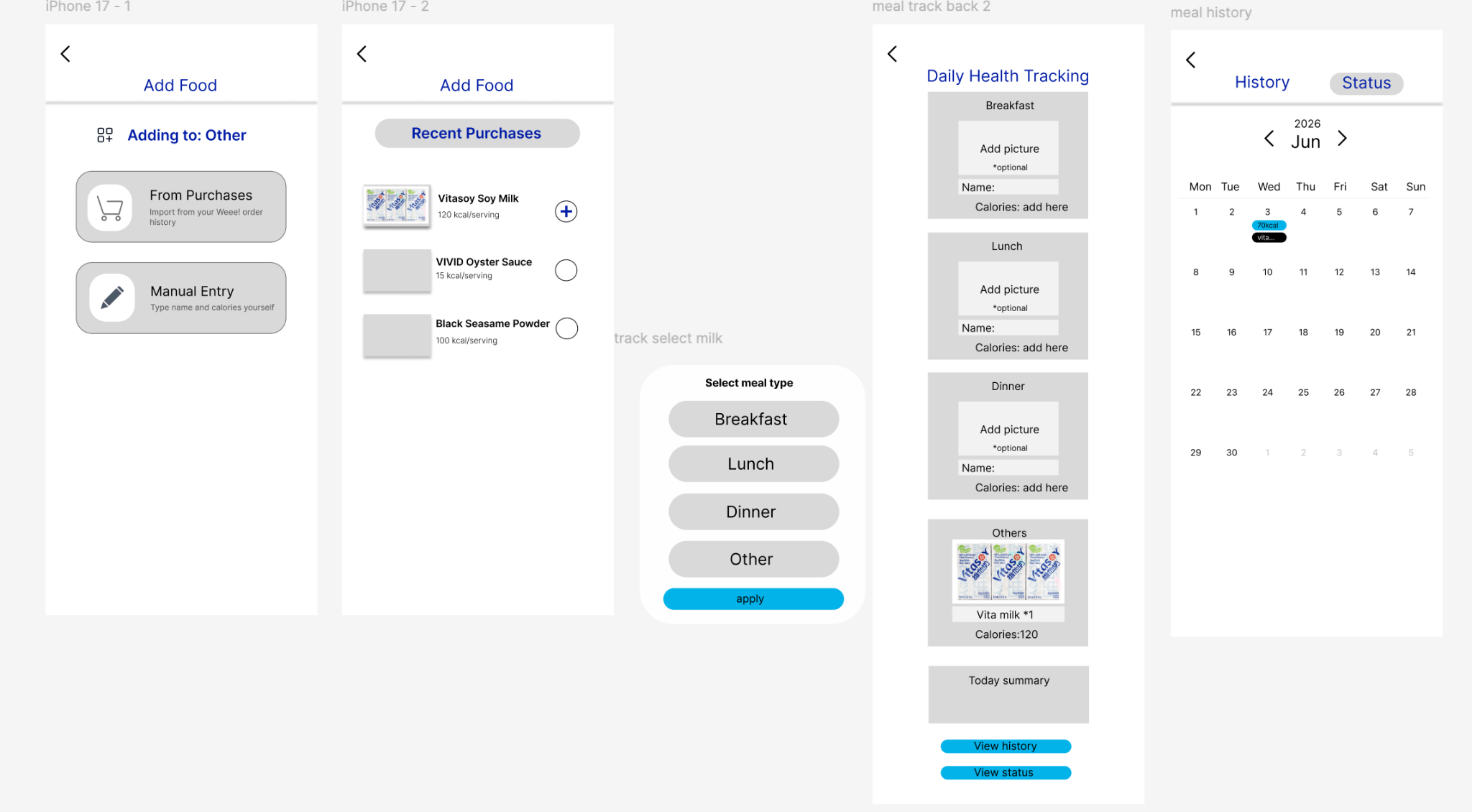
Purchased is not eaten
04 — Recipe → Tracking
Carry the context forward
Recipes helped users decide what to cook, but Health Tracking existed elsewhere in the product.
The user had to manually reconnect two actions that were already logically related: “I cooked this → I ate this.”
UX Decision: We added “Track This Meal” directly into the Recipe flow.
The next action should come from what the user just did.
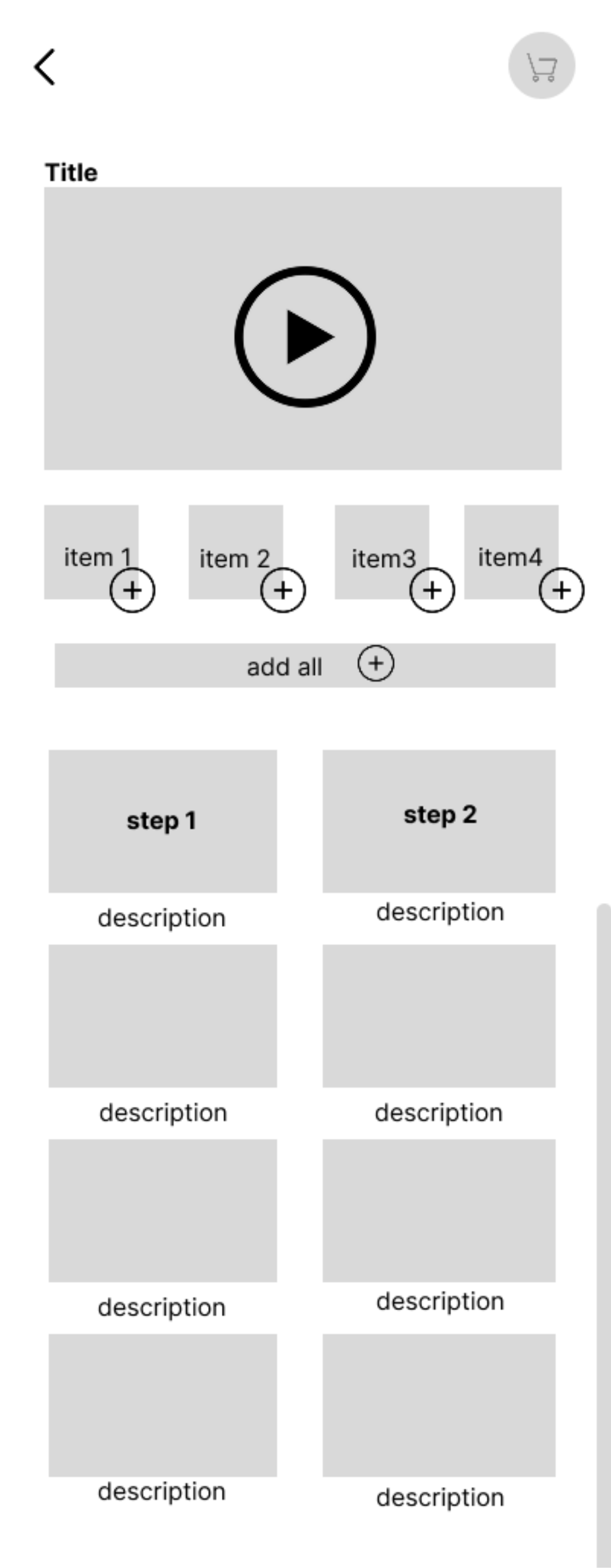
Track This Meal
Final Product Demo
The final prototype connects the core workflows across Health Mode, shopping, recipes, AI assistance, and health tracking.
Rather than presenting them as separate features, the prototype shows how they work as one continuous experience.
Where It Could Go Next
Future directions follow the same principle: provide more context without asking users to do more work.
AI Nutrition Assistant
Help users compare choices at the moment a decision is being made.
Personalized Health Scoring
Make “healthy” relative to individual goals rather than a universal score.
Community Recipes
Use other people's meals and experiences to make deciding what to eat easier.
My Role
I led most of the prototype work, using Figma to translate research findings into testable user flows.
My main focus was the logic between screens—what information users needed at each moment, what should happen next, and where the product was asking users to do unnecessary work.
I also led the Iteration & Fixes, Final Product Demo, and Future Directions portions of the final presentation.
Team: Yangchen Fu · Lang Ren · Grace Lai
Reflection
The biggest lesson wasn't how to design more features. It was how to question the assumptions behind a flow.
A prototype can connect every screen and still fail if the logic doesn’t match real behavior.
For me, UX became less about asking:
What should this screen look like?
and more about asking:
Why should the user have to do this at all?